Ecommerce
Improve Your Next Holiday Campaign’s CTA
September 30, 2021

The perfect holiday email is a lot like the perfect gift: thoughtful, personalized, and ultimately surprising. But without an equally impressive email marketing Call-To-Action (CTA), even the most carefully planned customer communication is very likely to go unacknowledged.
Adding an eye-catching CTA featuring personalized copy and spot-on placement is one of the best ways to boost conversion rates for your holiday email marketing campaign. So, before you hit send on those holiday messages, here are a few tips for crafting CTAs sure to convert.
When it comes to your CTA, nail the details
Copy that: Short and sweet is the name of the game when it comes to CTAs that convert. However, just because it’s six words (or less) doesn’t mean it shouldn’t still feel personal.
While most marketers know that adding a first name to an email subject line can boost open rates by as much as 18%, many don’t know that a personalized CTA can send conversion rates soaring along similar trajectories. Chances are, you already have all the data you need to create a compelling, personalized CTA. Using first-party data — the information audiences freely share with brands — based on clicks, conversion, and shares, CTAs can be every bit as personal as subject lines.
And, more importantly, every bit as effective too.
Design to draw attention: To make your good CTA a great one, remember: simple is best. The whole purpose of a CTA, after all, is to inspire action. And that’s highly unlikely if your audience doesn’t understand what is being asked of them or what their next step should be.
Once your copy is succinct, compelling, and personalized, make sure your CTA is designed to draw attention. Generally, your CTA should be in a color that stands out from the text — if it’s on a brightly colored button or visual element, even better.
If you’re a fan of color psychology, red and orange are both colors that indicate a sense of urgency. Your CTA button should also be bigger than any surrounding text in order to stand out, and should have a bit of breathing room separating it from the rest of your messaging too.
Place perfect: It can be tempting to have multiple CTA buttons if your goal is ensuring that customers don’t miss their chance to engage. After all, one CTA is good, so extra ones must be great. Right?
Not exactly. In fact, having more than one CTA can actually have the opposite effect. Studies have shown that your audience is less likely to click whenever there are multiple CTAs in a single email. In addition to all the additional clutter creating confusion about what each button actually does, multiple CTAs put your customers in a “Door number one or door number 2?” situation — and that decision can feel uncomfortable enough for consumers to avoid altogether.
Understand the dos and don’ts of conversion-driving CTAs
Do: Invite customers to click
Make sure the copy of your email has a strong connection to your CTA, preparing customers to take action with compelling subject lines, images, body, and personalized elements for maximum engagement.
Do: Find out what works for your audience
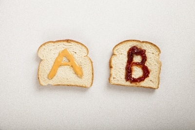
The final step in creating CTAs that drive conversions is experimentation. Test your copy, design, placement in order to find out which CTAs are driving clicks.
Don’t: Hide your CTA
Audiences can’t click what they can’t see. Make sure your CTA is separated from the rest of your text, carefully crafted in an eye-catching color, and slightly larger than the rest of your copy in order to ensure audiences know how to take those critical next steps.
The State of Brand Loyalty in the U.S. in 2023
Related


