Article
Build Mobile Loyalty with App Onboarding Like Sephora, BP, Snap Kitchen and Boxed
July 25, 2017

A good onboarding stream can do wonders to help make sure your users are continuing to make the most of your app on a regular basis, long after they’ve downloaded it. Onboarding is crucial in helping your users understand what your app has to offer, and reminding them of why they downloaded it in the first place. A good onboarding stream will also help win the permissions that allow an app to fulfill on its promise.
If your onboarding stream is less than awesome, there is plenty of inspiration to be found in companies that are doing a great job of this. Below are a few of our favorites, and some notes on what we can all learn from them.
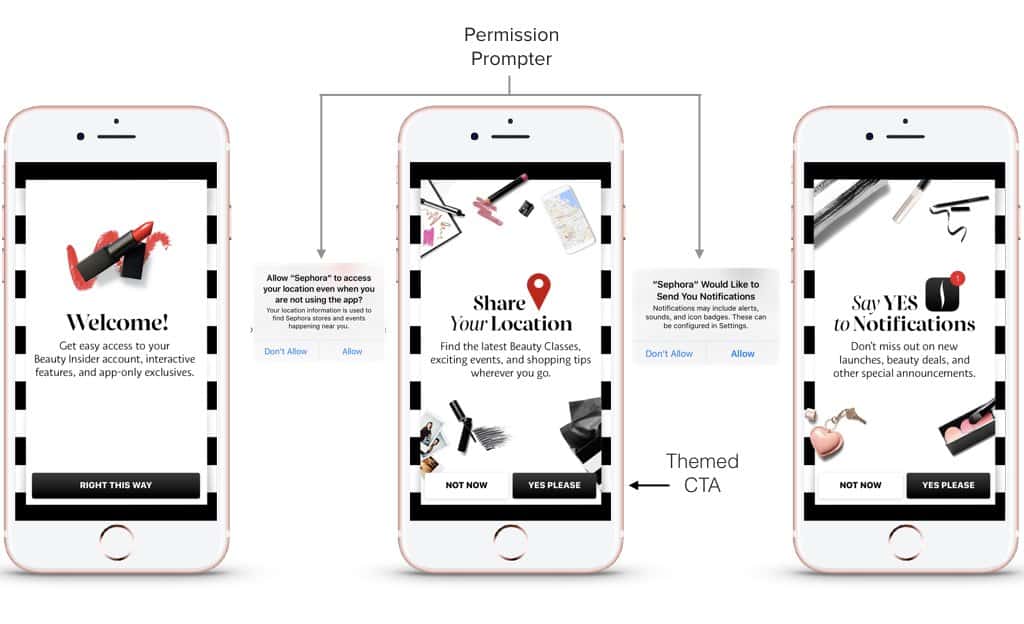
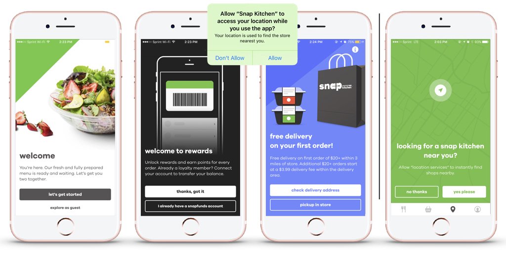
1. Sephora: Simple Designs, Beautiful Results
Sephora is a master of marketing — especially mobile marketing — and this onboarding series shows why.
- The first screen is both welcoming and attractive.
- Screen two doesn’t just ask for locations permission. It explains the benefits of doing so, in a non-salesy, non-pushy way.
- The third screen continues the appealing design theme and asks for permission to send notifications. Again, the benefits of doing so are front and center, and explained simply.
Together, this screens help boost opt-in rates.
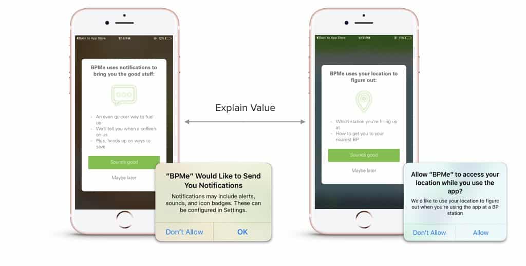
2. BP: Using Onboarding to De-Mystify Prompts
Like Sephora, BP uses well-designed prompting screens to preview the permissions it’s going to request. Since the permissions screens themselves don’t allow brands to provide much information about the use or value of granting permissions, these prompting screens become an effective way to encourage customers to opt-in. Those who don’t opt in can be prompted again later, using deep links to the push settings screen.
3. Snap Kitchen: Selling the App, One Screen at a Time
Snap Kitchen provides another great example of benefit-oriented onboarding. Snap’s design is friendly and informal, and clearly communicates why opting in is a great idea. New users are introduced to the Snap’s loyalty program (good idea to sign people up right away!) and offered free delivery on their first order. As a user naturally explores different parts of the app, they may see certain onboarding screens again. A customer who is trying to find a location near them suddenly has a clear rationale for allowing Snap to use location services, so they’ll be re-prompted with that screen.
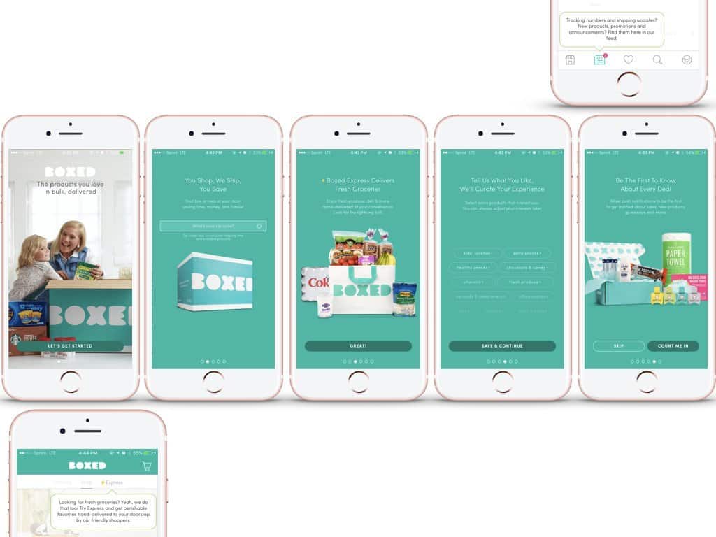
4. Boxed: Building Relationships, Right From the Start
Boxed’s onboarding stream shines in a number of ways.
- There are a couple screens that don’t ask the user to do anything. That may seem like a waste of space, but actually, it’s brilliant. It allows the user to learn more about the brand without feeling as if they’re being nagged.
- The first screen to ask for information seems eminently reasonable: Boxed wants your zip code, so it can calculate shipping costs.
- Next, Boxed asks about preferences for different types of foods, saying it will curate offerings. Again, this seems like no big deal: If you’re going to receive messages from a brand, they might as well be relevant.
- By the time Boxed actually asks for permission to send push notifications, it’s already established itself as friendly, helpful, and not a pain in the neck.
The State of Brand Loyalty in the U.S. in 2023
Related